
Showing posts with label QUT. Show all posts
Showing posts with label QUT. Show all posts


10 March 2016
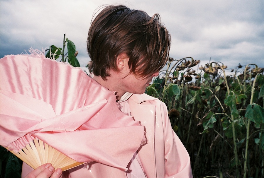
Bonus Content: Pastel Hick on Film

Styling / Creative Direction / Photography on 35mm film : Saskia Edwards
Creative Direction: Jonathan Rae
Model: Hamish Hill
Clothes: Aidan Renata / Sally Edwards
Rusted fields,
Frayed wire.
Yeah, my own pastel hick.






27 January 2016
Pastel Hick

Styling / Creative Direction: Saskia Edwards
Images / Creative Direction: Jonathan Rae
Model: Hamish Hill
Clothes: Aidan Renata / Sally Edwards
Rusted fields,
Frayed wire.
Yeah, my own pastel hick.


19 November 2015
QUT Fashion Graduate Show 2015 - Menswear

Words: Saskia Edwards
Images: Jonathan Rae
Each year, the QUT Fine Arts Fashion cohort puts on a showcase of the students’ final year work. It’s the culmination of three years of dedication to pattern making, sewing and perhaps hearing the word ‘garment’ in the millions of times. Here’s a look at the menswear collections. It includes Elvrik’s signature boldly colourful looks emblazoned with his logo, ‘Global Citizen’ and, somewhat ironically, braille - given the visually vivid nature of his collection. While Aiden Renata took his cues from cowboys. His muted collection is somewhere between southern belle, La vache qui rit and Marques Almeida. And Tom Summers’ ‘404’ does kind of resemble a glitchy webpage. His fabrics look like a frozen screen in a subtle and beautiful way. Anyway, here’s all the menswear looks at the 2015 QUT Fashion Grad Show MUSE//REFRACTED.
Tom Summers '404'


Jordan Anderson - Elvrik 'Global Citizen'


Aidan Renata 'Full Cream'


18 November 2015
QUT Fashion Graduates 2015: Felicia Balsategui 'Chimera'


In Felicia Balsategui’s work, you’re transported to a dreamy futuristic wonderland. ‘Chimera’ is littered with brands of 2015 internet culture like vaporware prints, bright colour and insta-geneic styling. The word Chimera references ancient Greek mythology where a creature is comprised of the parts of more than one animal. And Felicia’s collection is equal parts vividity, futurism and fun. I had a chat to her about it.
SE: What does your collection look like?
FB: So I guess you could say it’s almost as if it’s like Harajuku girls went into space. It’s quite girly and kitsch, but I’ve tried to keep it cool and street-style like at the same time.
SE: Why did you decide to do that?
FB: Well initially I was lost for ideas, so I just went and looked at some magazines and I was really intrigued by Japanese Vogue. Because I was looking at your normal Australia Vogue and British Vogue and I just found it to be a bit same same, but then when I looked at Japanese Vogue, their photoshoots - like it’s high fashion but it’s fun. And I really like working with colour, so I think that started the inspiration. And then just through research, I looked at surrealism a bit and liked the idea of making something fun based on surrealism but obviously it’s just about it being creative and super fun.
SE: Is that something you admire about the Japanese aesthetic? I mean, people like Rei Kawakubo and Yohji Yamamoto really pushed the boundaries of RTW fashion. Is that something you admire?
FB: Definitely. I love the fact that something can be considered high fashion, but it’s fun and colourful, but also artistic, but you can wear it. Ultimately, I think it’s nice that you can make something, but I want people to be able to wear it as well, like use it as a form of self expression for themselves.
SE: So three years ago, when you started out in your degree, did you think you’d produce anything like this?
FB: Oh my god, no, not at all, no way. Initially I remember thinking about my collections before this all started and it was very much, I think the idea was a lot more simple and the colours were a lot more muted and pale. And then I don’t know what happened, but I think doing that little bit of research... and I think my aesthetic changed slightly. Like I was more excited to create something a bit more poppy.
SE: What kind of materials did you use?
FB: One of the materials that I used is actually... technically called from Spotlight ‘Fairy Organza’ and it’s this really sheer, cheap, shiny fabric. It’s kind of purple. I’ve used it in different ways in quilting and layering. [I like] taking this cheap, plasticy fabric and making it into something a bit more high fashion. And then I’ve created my own print using think like Kodak squares and scanning things in.
SE: What do you want to do once you graduate?
FB: Ooh, this question! I guess I’m not too sure. Ultimately I’m looking to get more into styling and creative direction.


16 November 2015
QUT Fashion Graduates 2015: Cielle Marchal 'What Follows'

Words: Saskia Edwards
Images: Jonathan Rae
Model: Lilly at Vivien's
Deeply embedded in Cielle’s collection ‘What Follows’ is her family. Weaved throughout the pieces are her father’s artworks and her mother’s macrame. And, I imagine, her family’s sense of environmental and social justice. It comes together in a series that’s rich in technique and style. Here’s what she had to say about it:
SE: Why did you call your collection ‘What Follows’?
CM: Where it stems from was this idea of a post apocalyptic world where people were getting creative communities and creating things that were made from objects which they found from the past world including pieces of metal, bits of rope, bits of old leather, just scraps of pieces and they were creating these objects that remind them of the world that was. It all subconsciously came from this pen and ink drawing that’s always been in my house of these two little robots holding hands in this mangrove mechanical jungle in the year 2020 - where he [her dad] painted it in 2000. So ‘What Follows’ is, what follows after this world.
SE: What does that actually translate to looking like?
CM: So the collection is very dark, it’s definitely not as dark as I intended it to be. But it kind of suits the theme I think. It also has a lot of wire, macrame and knotted outer pieces, which go over the clothes and there’s a couple of prints that I’ve used from my father’s artwork which are paintings. One’s a portrait painting of his girlfriend in the 80s and the other’s just a really abstract blue, black and white painting which geometrical patterns, which I manipulated in photoshop and created this print... And the accessories tie in with the shoes, which I painted faces on them, which is spray-painted with white leather paint. And the rest have got wire wrapped around them and knitting wool.
SE: How does your father feel about you being so influenced by his work?
CM: I think he is pretty stoked. I’ve always wanted to a collaboration with him. I’ve kind of had a vague idea that I would do that in my final collection, but maybe more within the accessories. But it just turns out that it happened to be on the clothes.
SE: So you had an idea when you started out that you would do something like this?
CM: Well it was a very different idea. The collection was completely different at the beginning of the semester to what it is now. It was very wearable - it was lots of shirts and pants with random placements of the print within those. Now it’s turned more etherial because I was also influenced by movies like Mad Max and Satyricon.... Most of the outfits are very full-length and pleated from shoulder to ankle and a lot of golds and metallics and lush fabrics.
SE: Any idea what you want to do once you graduate?
CM: In the long term I definitely want to get into the ethical and sustainable side of fashion. So hopefully work for someone who has those values engrained in their business core. And then in the more long term, have my own label which incorporates all those elements in the making of the garment.


15 November 2015
QUT Fashion Graduates 2015: Isabel Wengert 'LST'

Words: Saskia Edwards
Images: Jonathan Rae
Model: Lilly at Vivien's
Isabel Wengert’s collection ‘LST’ is comprised of a series of rectangles and squares. But it’s not really geometric - it’s more fluid and organic. Throughout the garments are splashes of pink and abstract faces. I sat down with Isabel and had a chat with her about her 2015 Fine Arts Fashion graduate collection.
SE: Could you walk me through your collection?
IW: My collection is called LST, which stands for Line Shape and Texture. It’s an exploration into those three components of my work. I looked at lines through my drawing and also playing with asymmetry a little bit. I’m playing with the balance of line, how far you can take unexpected line. And then shape came because I was really inspired by Malevich’s motif of the square, so that is throughout the collection. And a lot of my patterns are made from squares. And the texture part comes because I use a lot of... knitting and embroidery throughout it as well. I was also trying to make materiality more important than form which was inspired by Gutai art, which was a movement where a painting would be important for the paint as opposed to the subject.
SE: Why did you chose to explore that?
IW: I think that those three components have always influenced my work and so I just kind of wanted to take this chance to explore why they are interesting to me by creating a bigger body of work and incorporating them.
SE: Can you describe what people will see on the grad show night?
IW: A lot have people have described it to me as ‘interesting’, which I think is probably a fair word because it’s not necessarily conventionally beautiful. The garments don’t look traditionally like garments, in as much as, but they’re obviously still garments. But because a lot of them are based on squares and they are literally squares and rectangles and the finishings are quite different... it kind of all looks imperfect in a way. It doesn’t look neat and it doesn’t look pretty. But I think at the same time it looks quite tactile because it is quite, even with the painting and the weaving, it’s still quite textural.
SE: How has your practice, aesthetic, process changed over the last three years since you’ve been studying Fine Arts Fashion?
IW: I think when I first started designing I was trying to attain this outcome of perfection. So everything that I started I would always try and make it look really perfect and really neat. And it was something I always struggled to achieve. So I would always start with these ideas and I was never able to fully realise them and I think probably half way through last year I stopped trying to achieve this. Because I realised that that wasn’t really my aesthetic. And I started to question why I was even fighting against this distortion within my work and so I started to embrace it, and that was a big turning point for me.
SE: What do you want to do after you graduate?
IW: I’ve applied for Honours next year, so I’d like to do further study. And I’m not too sure about in the long run. I think I’d like to get into the academic side of fashion or potentially something to do with visual art, so creative direction or something like that.


18 October 2015
Men in Uniform: A collection by Sally Edwards

Words: Saskia Edwards
Images: Jonathan Rae
“I love a man in uniform.”
It’s a phrase that’s perhaps been uttered by everyone from Samantha Jones to Chairman Mao.
Uniforms, particularly military garb, embody everything that it is to be stereotypically male: practicality, utility, strength and boldness. And, as the word suggests, the clothing forces the person wearing it to conform and assimilate. Namely, it forces uniformity.
Sally Edwards sets out to explore these ideas (and challenge them) in her collection ‘Men in Uniform’.
“[Uniform is] made for practical purposes, it’s made from hardwearing fabrics and the shapes - exaggerated shoulders and focus on utility aspects such as pockets,” she says.
“Those are the things that give them that masculine look.”
Her collection focuses on the classic shapes of uniform. There’s a double breasted coat, navy-style wide leg pants and military pocketing. But it’s all a bit, well, camp.
Jackets are in blush PVC or covered in tangelo fur, uniforms are turned into short playsuits and trousers are made from red port corduroy.
“I’ve tried to focus on military tropes. So specifically one of the things you’ll notice in the collection is experimentation with silhouettes that would be associated with military uniform.
“Such as like there’s a coat in there that’s referencing... an overcoat that’s utilised in the military and trying to play with the proportions and exaggerate the shoulders and cinch the waist and kind of playing with the cuts.
“And also exaggerating the pockets, so it’s something that’s known as a utilitarian aspect.
“Sort of exaggerating them to the point where there’s purely aesthetic and lose their functionality.
“Mainly just playing with cut and trying to evoke a campy aesthetic through slightly altering something that’s familiar.”
Sally’s collection shows how “menswear can push the boundaries in a way that womenswear had done many years ago”. Now, there’s very little in womenswear that’s considered outrageous. The likes of Vivienne Westwood, Alexander McQueen and Rei Kawakubo really did all the hard work in that area.
But Sally’s collection raises another issue: does fashion need the “codification of gender identities”? I mean, in order to be new and innovative, do we need the established? Is it possible to be outrageous and progressive unless there is an accepted idea of normality? In a way, fashion is generally trying to be avant-garde, but it relies on conservative ideals to push against. What I’m trying to say is, do we need uniforms so fashion can be nonuniform?


Subscribe to:
Posts (Atom)