Showing posts with label Brisbane Designers. Show all posts

10 March 2016

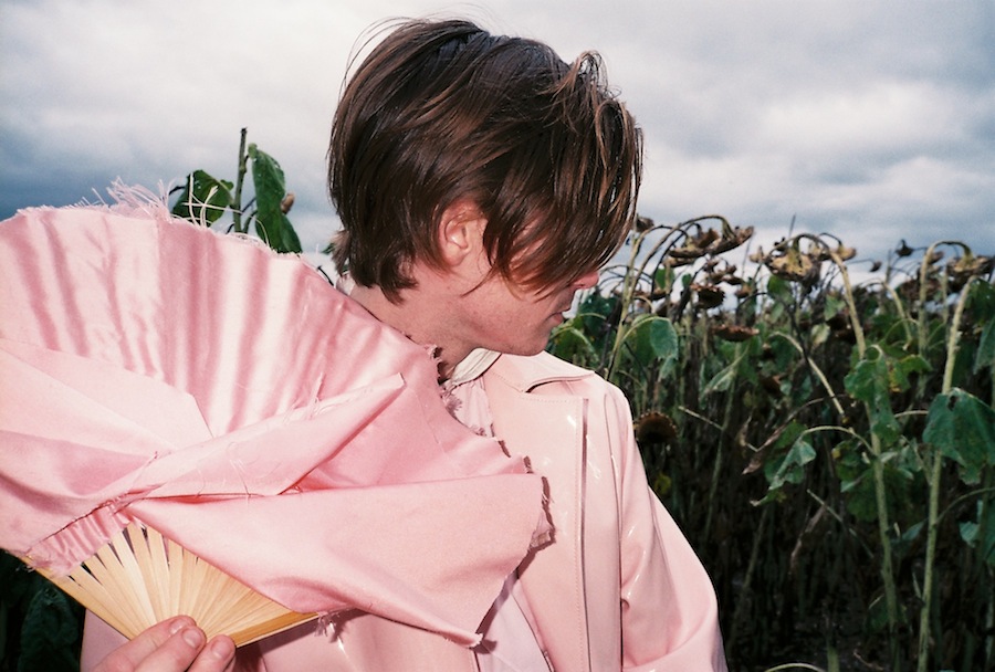
Bonus Content: Pastel Hick on Film


 Styling / Creative Direction / Photography on 35mm film : Saskia Edwards
Creative Direction: Jonathan Rae
Model: Hamish Hill
Clothes: Aidan Renata / Sally Edwards

Rusted fields, 
Frayed wire.
Yeah, my own pastel hick.


27 January 2016

Pastel Hick


 Styling / Creative Direction: Saskia Edwards
Images / Creative Direction: Jonathan Rae
Model: Hamish Hill
Clothes: Aidan Renata / Sally Edwards

Rusted fields, 
Frayed wire.
Yeah, my own pastel hick.


8 February 2015

Backwater Broadshore


Images/Creative Direction: Jonathan Rae
Styling/Creative Direction/Words: Saskia Edwards
Styling: Jewel Horton
Assistant: Ren Scurville
Model: Rachel W at Busy Models

The city is a gold plated magnet,
Wrapping hope in plastic,
Leading hypnotised eyes to stiff mattresses and pay-by-the-hour.
While dreams marble the pool
Coalescing chlorine with desire.
And boredom starts to suck blood,
Like a leach attached to the sun.
Faded plastic sighs,

Disintegrating in endless time.


11 October 2014

Aesthetic Fixation X Shanna Muston: Wooden Memories


Words and Creative Direction: Saskia Edwards
Images: Jonathan Rae 

Wood is part of so many foundations; warmth, shelter, life. It holds memories and bends with memories. Shanna Muston explores this nostalgia in her small objects and jewellery. They're comprised of silver and pieces of timber from Queenslanders. These iconic buildings have created a shared memory for thousands of people who can reminisce on squeaking floors, ribbons of wind escaping through cracks in boards and all the verandas that are different but the same. The memories held in Shanna's jewellery are as much my memories as much as they are your memories as much as they are everyone's memories - sinking into the same colours, sounds and emotions. 


13 September 2014

House of Ezis X Aesthetic Fixation: Jet Kingdom in film


Watch in HD here 
 
Words/Styling/Creative Direction: Saskia Edwards
Film: Diego Aquilizan/Jye Wordsworth
Film/Creative Direction: Jonathan Rae
Assistant: Jewel Horton
Model: Wendy Ma

The Heydar Aliyev center in Azerbaijan is beautiful. It’s fluid, seamless, with unbreaking lines.

But despite its fluidity, the structure will always be static. The giant white building will never be active or dynamic - it’s fixed in its hardened form.

This is one of the reasons Andrzej Pytel, father of House of Ezis, ditched his established career in architecture to pursue garment design.

“Architecture was my main design background, but I just felt like I couldn’t express myself creatively so that’s when I shifted to adapting some of my prints into textiles - like my t-shirts.

“And then slowly it evolved into what I do now, which is formal wear. And it’s all self-taught.

“I have no formal training in fashion.”

Andrzej’s design has certainly evolved from its experimental, architecturally influenced origins. Andrzej’s foray into the fashion realm started seven years ago, but he only began to learn traditional methods of tailoring in the last year. 

“Having arrived at that point through my exploration it then allowed me to integrate the way I work and this more traditional method.

“I think that’s what really brings the edge into my work, that balance of the traditional and the contemporary.”

But Andrzej hasn’t completely abandoned his architectural past. His work retains an equilibrium between draping and structure - fashion and architecture. 

“It’s all about the geometry, the way the materials express themselves and being true to the materials, the way those materials interact with the body, the way the body influences the materials to drape.

“So I suppose that’s maybe the main thing that’s emerging out of my work is the relationship between the fabric and the body and the motion that creates the garment.”

While Andrzej’s design aesthetic has developed significantly, he is returning to the pillars of his original model.

“It’s a very special moment in the brand because I’m bringing back a lot of the things I was doing back when the brand was started and it’s a moment where I’m integrating my womenswear and menswear and also the earlier kind of festival-type really heavily printed things and that’s going to be launched under the Ezis brand.”


In about a week’s time, House of Ezis will undergo a renaissance returning to its original name and look - proving not only the fluidity of the clothing, but the label.

8 September 2014

House of Ezis x Aesthetic Fixation: Jet Kingdom


Words/Styling/Creative Direction: Saskia Edwards
Images/Creative Direction/Styling: Jonathan Rae
Assistant: Jewel Horton
Model: Wendy Ma 

“About here, she thought, dabbling her fingers in the water, a ship had sunk, and she muttered, dreamily half asleep, how we perished, each alone.” - Virginia Woolf To the Lighthouse


As in Virginia Woolf’s To the Lighthouse, the sea broods at the edge of the faded horizon.   And pools of cool brine ripple on the borders of rocks, each their own stony hamlet. Discarded forrest green bottles drown in motes. The bay, Moreton Bay, is silver glass, or black glass with iridescent white streaks. The sea carves the sand with its forever tidal habit. It leaves its own sandy calligraphy. But the liquid surface shatters and the hard ridges and troughs on the dunes break under foot. Toes enveloped in muddy quagmires. The landscape is bleak and eternal, stretching forever, going nowhere. 


12 July 2014

Bloods

 
Images: Jonathan Rae
Words and styling: Saskia Edwards
Jewellery: Teresa Lee
Model: Gabz Tumataroa

What’s ugly? What’s beautiful?

Can scabs, blood, decaying flesh be adornments?

Well, Teresa Lee’s jewellery is beautiful.

But look a little closer, her grills are rotten, her rings are deformed and her earrings are tarnished with blood and intestines.

Teresa: “Some of these pieces have scrunched and tangled hair that resembles hair from a shower plughole.

“It is interesting how parts of our body can be attached at one moment and then treated like rubbish and thrown in the bin the next moment.”

If you look even closer, you can see faces in the silver. Teresa took old photographs, buried them with blood, dug them up five days later and transferred the warped images onto silver.

“Well the whole concept was, some of our family just ditched us because I don’t know, well I do know.

“But you think family sticks together, but apparently not.

“The blood was representing the deterioration of the relationship, but it was a family relationship. “

The blood is about Teresa’s DNA.

The locks allude to the Victorian Era’s mourning jewellery, for the death of family relationships.

And the imperfections on the photographs are about loss.

“The messing up the photos was to show the memories meant nothing.”

Teresa’s grills are part of a more recent series. They’re meant to evoke disgust.

“The mouth is not clean, it is full bacteria, yet there is still hesitation to put a clean and safe, although apparently gross, grill in the mouth.”

But in fact within the perceived grotesques of these concepts lies the beauty of Teresa’s work.

It’s a forced reconsideration of what’s beautiful.

Are pictures of vanity that permeate modern internet culture real beauty?

Maybe these images are more repugnant than scars or disfigurements.

Maybe our idols reach deity status for superficiality and hollow morals.


Perhaps marred skin has more beauty than the self-absorption of perfection.